The Poster is Dead
We’re surrounded by images: everywhere we look, adverts vie for our attention. But where posters were once static, our eyes are now drawn increasingly to moving pictures. Traditional graphic design on paper is gradually giving way to ‘motion design’ on screens.

Merijn & Jurriaan Hos
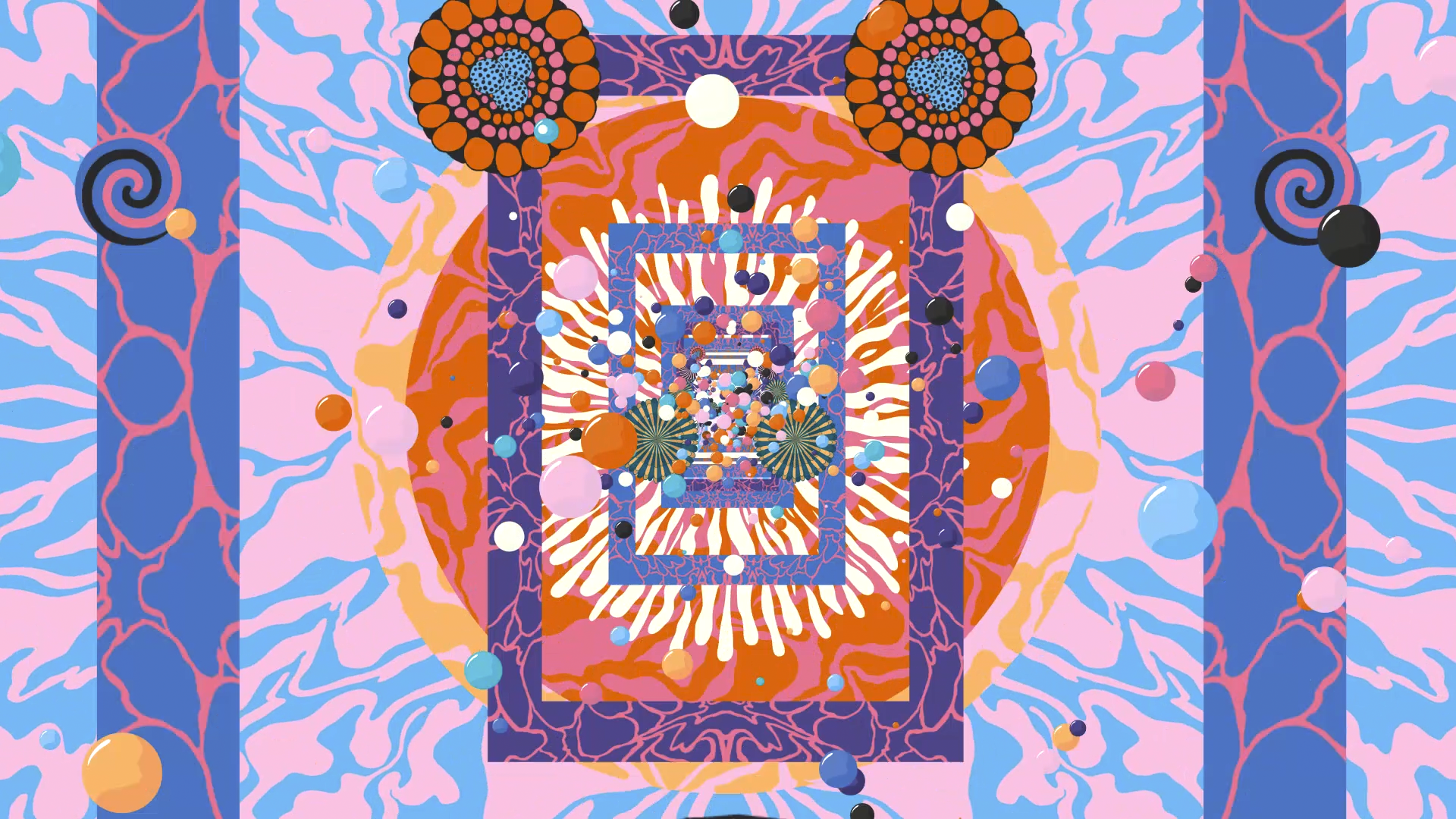
The title of the exhibition is obviously tongue-in-cheek: beautifully designed posters are still being produced. All the same, moving images on screens have now firmly established themselves in our everyday lives. From railway stations and motorways to shops and bus shelters, wherever you go, you’ll find a flickering screen running brief and colourful full-motion videos that try to grab your attention. For advertisers, motion design offers the additional benefit that a moving image can get a commercial message across in just a few seconds.


Besides the public space, ‘moving posters’ are increasingly used online too. YouTube, for instance, has its ‘pre-rolls’ – the ads that run before the video the visitor wants to watch. Social media deploys ‘teasers’ to entice viewers with a sneak preview or an announcement, while websites frequently serve up ‘banners’ or online commercials. All these pre-rolls, teasers and banners are invariably colourful and stylishly designed works of art.

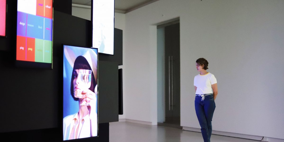
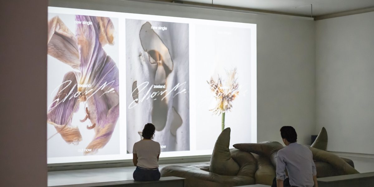
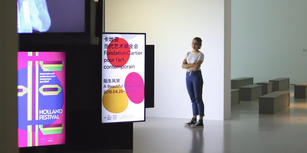
There are three parts to ‘The Poster is Dead’: a column with screens, a projection room and a small gallery. The column is used to show a selection of 18 videos by seven agencies: Studio de Ronners, Thonik, Hansje van Halem, Trimtab, Machine, Colorbleed and Lesley Moore. Two or three videos are played by each of them. The projection room, meanwhile, is screening 12 videos by Merijn & Jurriaan Hos, who specialize in motion design and have been at the forefront of its development. And the small gallery focuses on motion design images in their everyday context: ‘MUPIs’, which display full-motion video in the street, festival screens, and video hoardings on the side of buildings.


