Tokyo as modern design
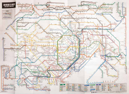
Even when using the smartest design methods to schematise underground and overhead rail networks, representing rail lines of the world’s largest metropolises results in a practically illegible jumble of lines. This is a schematic map of almost all public heavy rail transport in the Greater Tokyo area: a mega-metropolis of 35 million inhabitants featuring a network of almost one thousand stations. Metro maps are quintessentially modern design. In 1933, Harry Beck designed a revolutionary map for the London Underground: the ingenious application of diagonals enabled him to break free from topographical representation. The Underground map image became an icon of modernity. An additional advantage of breaking free of the ‘topo map’ is the fact that stations at the edges of the network appear far closer to the centre than they are in reality. Tokyo’s underground rail system is a relative newcomer, with its first line dating back to 1927. After partial privatisation, two underground rail companies, commercial railway lines, and the state railway company now appear to operate side by side and interchangeably.

Mapple (Shobuncha), Rail Map of Tokyo Aera, JR-lines, Private Railways, Subways, Monorails, All Staitions (sic), Tokyo 2022. Coll. S/T Y.3i.9, 62,5 x 88,5 cm.
