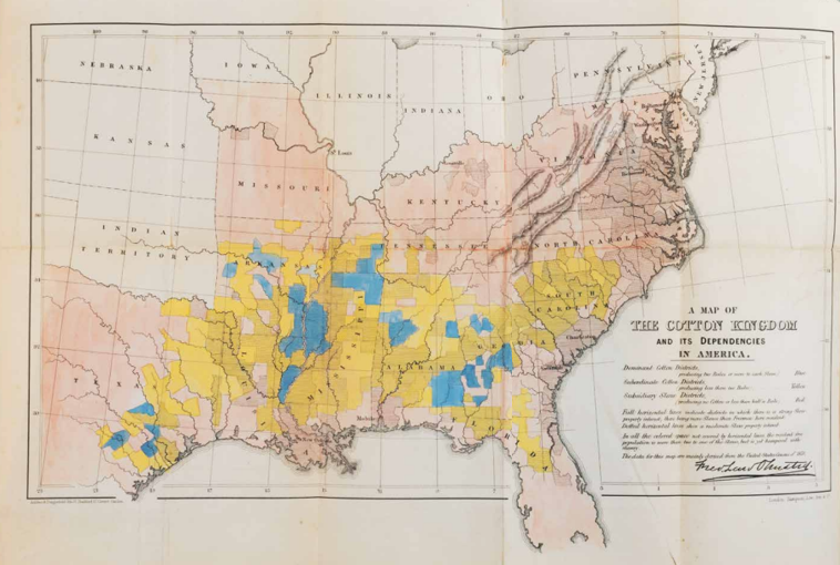
Map of the Cotton Kingdom
American landscape architect Frederick Law Olmsted (who also designed New York’s Central Park) travelled the southern United States from 1852 as a journalist. At the beginning of the Civil War, he compiles his reports for the British public in The Cotton Kingdom. He describes the system of slave plantations: a small elite enriches itself, but industry impoverishes the majority economically and culturally, and causes enslaved people untold suffering. The map captures his argument in one image. Olmsted shows areas with high (blue), medium (yellow) or low (pink) cotton yields, measured by ‘cotton bales per slave’. He also distinguishes land areas where slave labour is dominant (horizontal lines), moderately prevalent (dotted lines) or where there are at least twice as many free as unfree citizens. Combination of both factors proves that efficient production does not depend on slave labour. Olmsted’s map shows that abolition will not lead to a collapse in cotton production, nor to uncontrollable price inflation. Thus, a victory of the ‘Unionists’ over the (southern) ‘Confederates’ poses no threat to British interests.

F.L. Olmsted, Map of the Cotton Kingdom and Its Dependencies, in: Journeys and Explorations in the Cotton Kingdom. A Travellers Observations on Cotton and Slavery in the American States, 2 Vols, London 1861. Coll. S/T U.7v.104, 31 x 59 cm.
