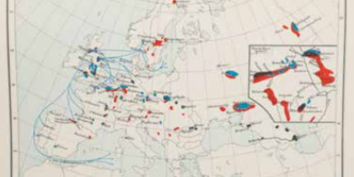
Shifting cotton imports
Charles J. Minard is the founder of the infograph, an informative visual representation of spatial and statistical data on a geographical background. On these three infographics showing cotton imports in the years 1858, 1864 and 1865, Minard shows the crisis in the European textile market at the hands of the American Civil War. Each millimetre width of a coloured lane represents 4,000 tonnes of raw cotton, with the colour varying by country of origin. A comparison of those figurative maps shows that exports from the southern states, which first dominated the European textile market, completely collapsed due to naval blockades during the Civil War. In fact, shortly after the victory over the northern states, those exports barely recovered. Meanwhile, Europe has unlocked new imports of raw cotton by intensifying colonial production in India and the Middle East in particular.
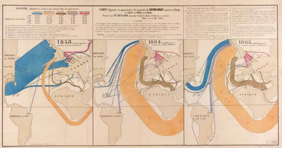
C.J. Minard, Carte figurative et approximative des quantités de coton brut importées en Europe en 1858 en 1864 et en 1865, Paris 1866. Digital print, Bibliothèque nationale de France, FRBNF40666359, ± 40 x 70 cm.
More chapters
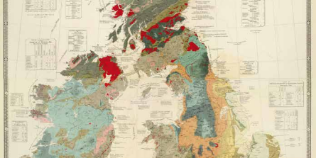
1a,b. Geological and palaeontological map
Colour lithograph British Isles Geology and palaeontology are becoming important in locating mineable resources. This colour lithograph of the British Isles reviews the geological knowledge of the area, the formation of rocks and sediments in the Earth’s crust, and fossil remains of organisms below the Earth’s surface.
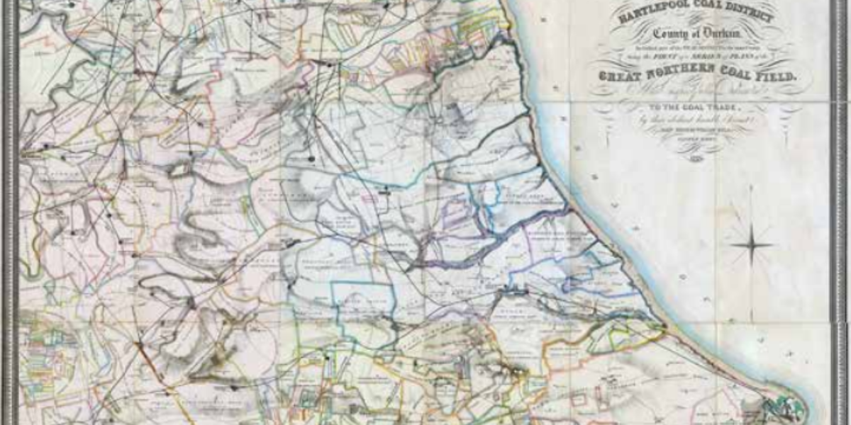
2. Hartlepool Coal District
Coal fields of northwest England This map of the fields of the Hartlepool coal district in north-west England provides information on all landowners, the percentages to be paid on mineral yields, and the modern network of mines, railways, and workers’ villages.
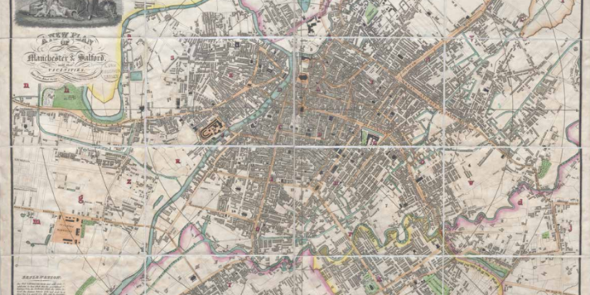
3. Plan of Manchester
Manchester cotton capital This 1829 map of Manchester is divided into circles, which in turn are divided into smaller sections. The centre is formed by the Textile Exchange, even though it is not at the centre. With alphabetically arranged sectors and a separate list of names, streets can be found quickly on this modern and…
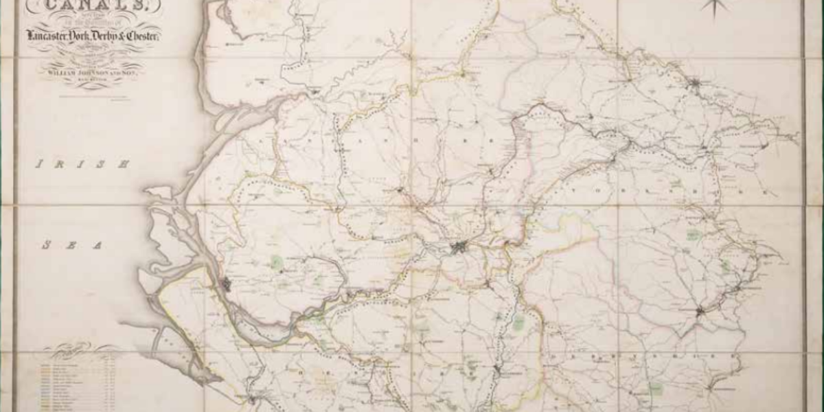
4. Canals
Channel map On this map of 28 canals in north-west England, each canal is coloured separately, indicating the maximum length and width for boats. Water levels above sea level at low tide are also given for each canal section in ‘feet and inches’.
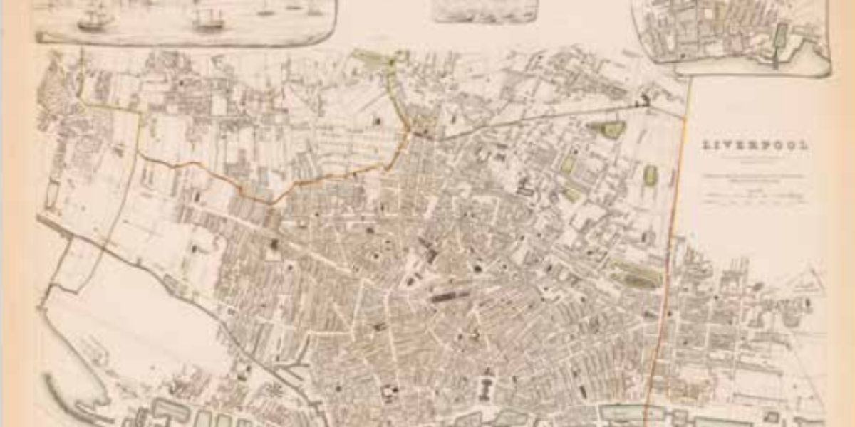
5. Liverpool
Liverpool map This map of Liverpool aims to promote ‘useful knowledge’. This city with its harbour docks became rich from its leading role in the British slave trade and then from importing raw cotton from slave plantations in the southern United States.
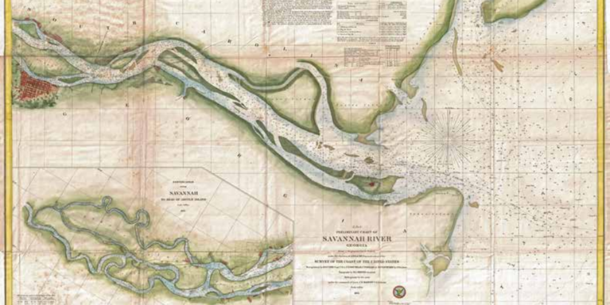
6. Savannah River
Savannah River, Georgia This modern coastal map shows the Savannah River in Georgia, from its mouth to the city of the same name. Every navigational beacon and buoy are inscribed and the depths of the riverbed are given in fathoms. Savannah was important as a port for the cotton plantations in its hinterland until the…
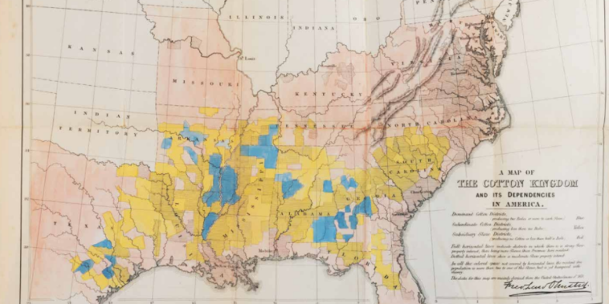
7. Cotton Kingdom
Map of the Cotton Kingdom American landscape architect Frederick Law Olmsted (who also designed New York’s Central Park) travelled the southern United States from 1852 as a journalist. At the beginning of the Civil War, he compiles his reports for the British public in The Cotton Kingdom. He describes the system of slave plantations: a…
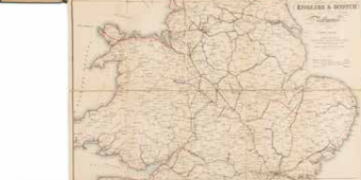
9. English and Scotch Railways
Exponentially growing UK rail network Charles Cheffins’ map shows a nation at full speed by showing existing railway lines in black, indicating lines under construction in red and projecting lines in blue.
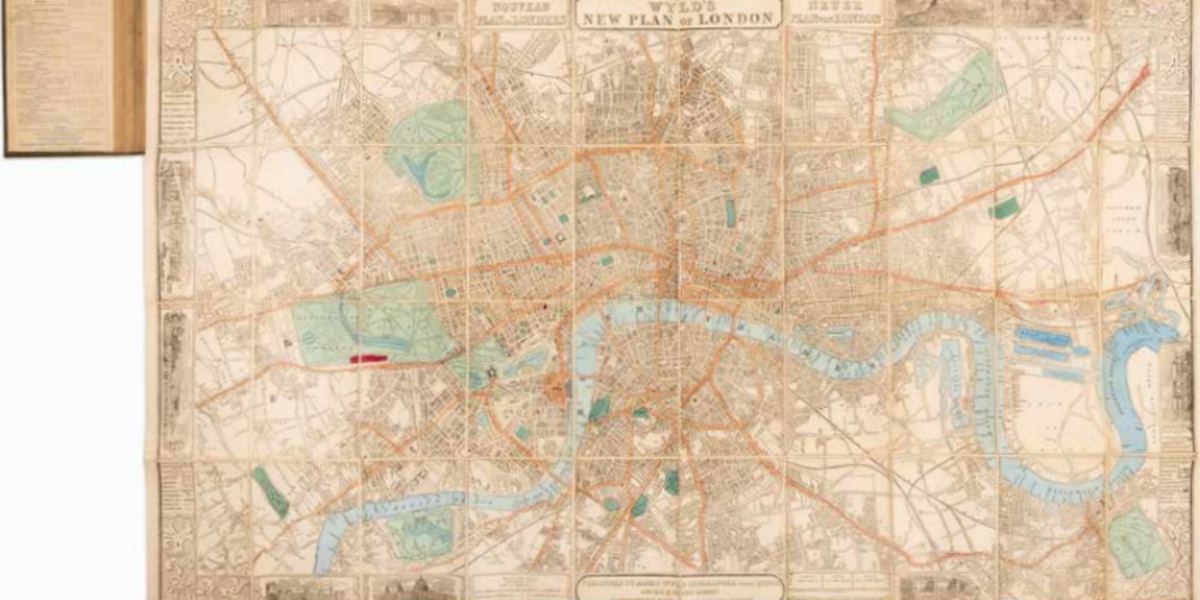
10. Map of London
First World’s Fair in London The international nature of the first ‘World Fair,’ with its spectacular shows of leading British industry, is evident from James Wyld’s special map of London: the titles and legend are also in French and German.
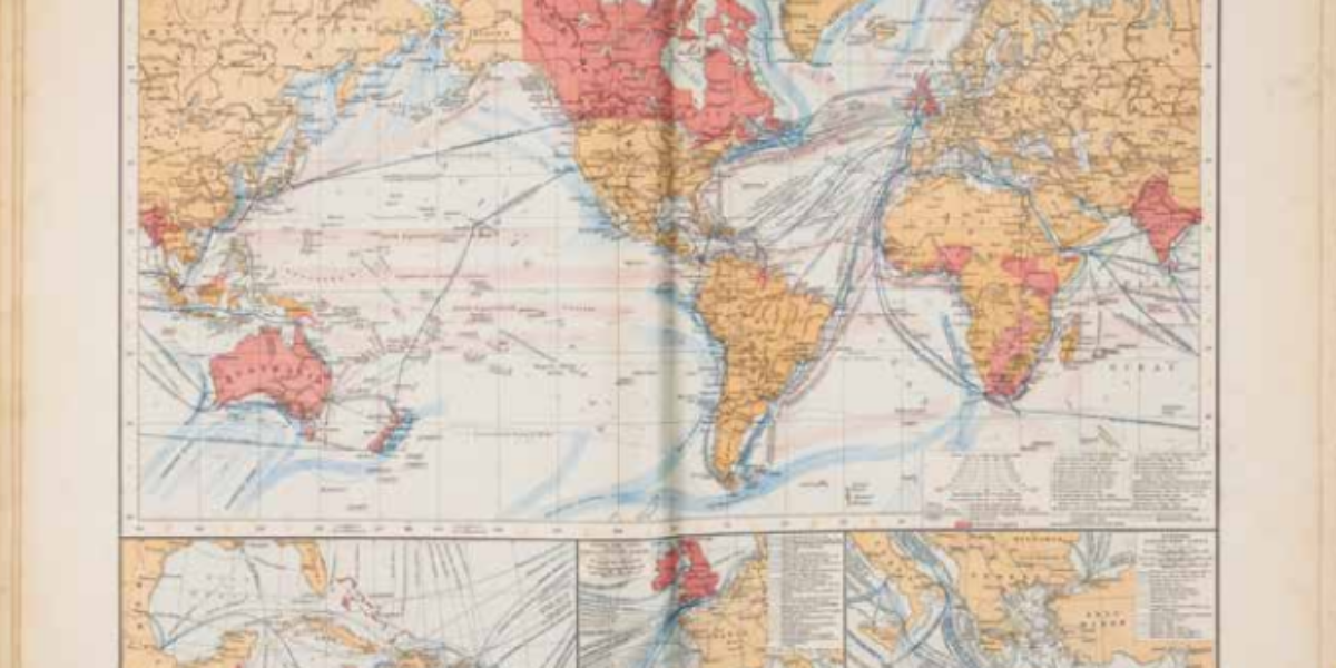
11. Commercial Routes
Shipping routes and British Empire This world map in Mercator projection presents the British empire (in red) at the height of its power. Cold gulf streams are blue, warm streams are pink. The map shows the numerous routes of steamships between the larger ports. The three insets name the shipping companies operating regular scheduled services.
12. Trade Atlas
Dutch trade atlas The Hague headmaster J.J. ten Have designs the first Dutch trade atlas. In it, he visualises series of economic data in simple maps. This map shows how during the 19th century the industrial revolution gained a foothold from Wallonia and the Ruhr to Plojesti and the Donbas (the Donets Basin). Ten Have…
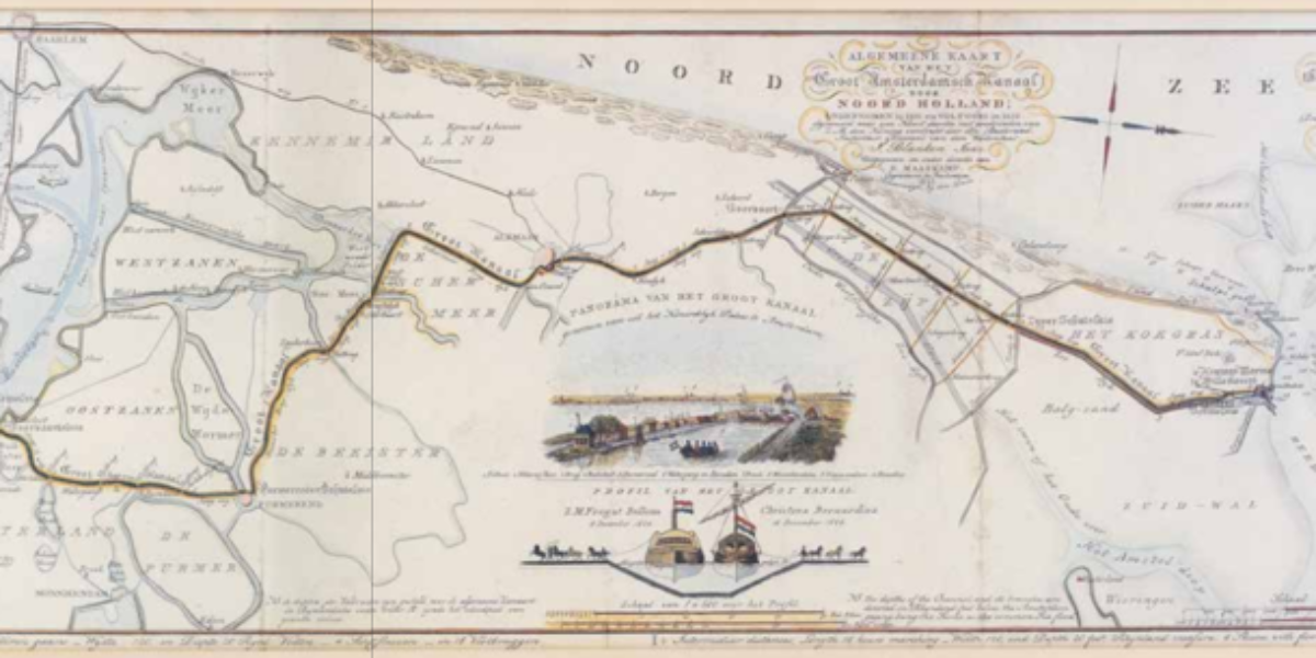
13. Groot-Amsterdamsch Kanaal
Prestigious North Holland Canal This trilingual survey map of the North Holland Canal celebrates the commissioning of this prestigious project. William I, the ‘canal king’, ordered the digging of this 80 km canal, 37 metres wide and 5.68 metres deep. Horses pull wooden sea ships from Den Helder to Amsterdam within a 24-hour period.
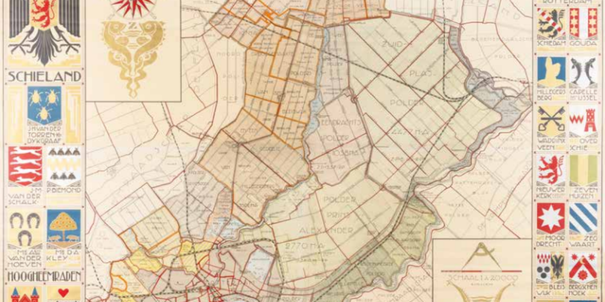
15. Hoogheemraadschap
Schieland Water Board This art deco colour lithograph in four sheets celebrates this Water Board’s 650th anniversary. The cover area and surface measurements of the polders are shown on the map, as well as the mills and pumping stations. Note the funny fake family crests on the left.
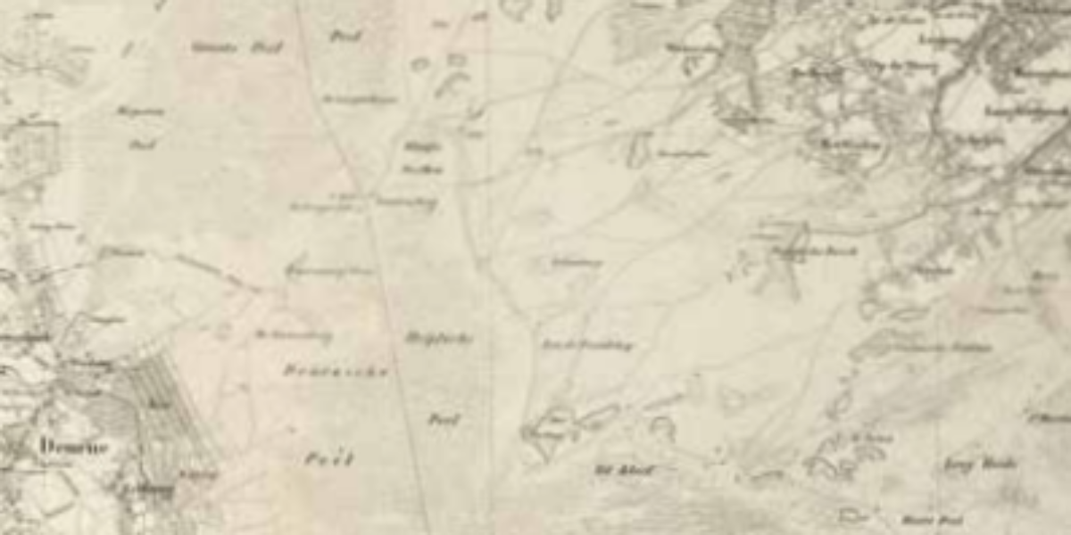
16a,b. Military Map
Military-topographical map In 1854, the Peel was still 75 km long and ± 15 km wide; a landscape with heathland, sand dunes, a lot of liquid soil and bog (raised bog), and shallow pools. People started making this ‘onland’ productive by digging canals for drainage and transporting black peat. In 1921, halfway between Deurne and…
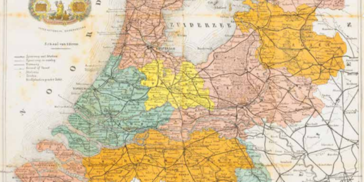
17. Railway map of the Netherlands
Railway map of the Netherlands This railway map of a cigar factory in Kampen shows the network of railways and tramways of the Netherlands in 1912. Competing companies provide the operations. In 1909, the government introduces a single national time, eliminating confusing timetables with local times.
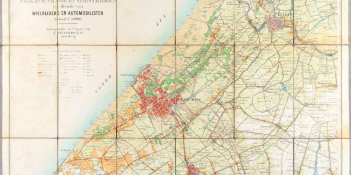
18. Wielrijders en automobilisten
Cyclists and motorists around The Hague After the establishment of the Provincial Water Authority in 1875, the province of South Holland resumes involvement in waterways, rail and tram lines, and gravel and dirt roads, which are also distinguished on this map. The abolition of tolls on the roads stimulates traffic.
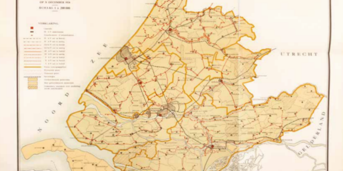
19. Stand der Electrificatie
Electrification in South Holland This province map shows electrified and non-electrified municipalities plus those still negotiating for connection. In 1924, the Leiden Light Factory also started supplying cheap electricity for home heating.
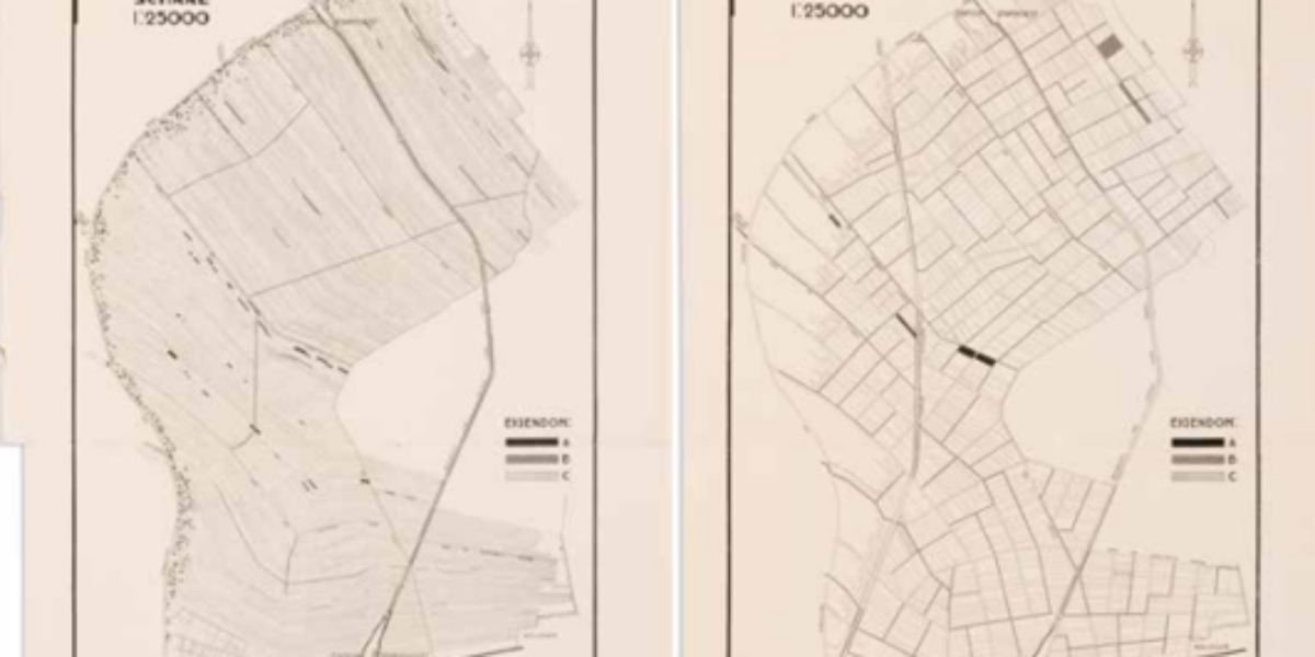
20. Ruilverkaveling Staphorst
Land consolidation in Staphorst From 1924, land consolidation is possible with the consent of the majority of stakeholders. In Staphorst, where farmland of 20 metres wide sometimes stretches as long as five kilometres, this redistribution reduced the number of cadastral plots from 13,000 to 1,900.
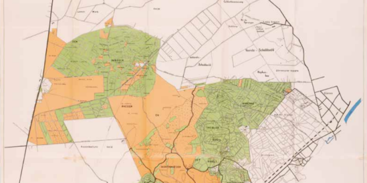
21. Veluwezoom
Veluwezoom National Park The ‘Veluwezoom’ becomes the Netherlands’ first national park in 1930. Natuurmonumenten aims not only to protect endangered areas but also to make visitors know and love nature better. By 1939, there are already ninety state nature monuments spread throughout the Netherlands.